Through the Window
Through the window is a book containing a collection of human interactions focused on vulnerability and connection. The book is designed to let the words and experiences shine, and in reading and relating to the experiences you become part of that human connection.
The Personal Inspiration
I wanted to connect with the community I have been told over and over I should be a part of, both by the world and by my own mind. Because of social failings, life changes, health issues, etc., the ability to join the social landscape here on campus seemed to escape me. So from this isolating feeling I decided to push myself. What I found most challenging in design coursework was creating books. I had a hard time visualizing the layout and finding a consistent design. I also have a lot of anxieties around trying to create new relationships. So I decided to combine both of these shortcomings into a major project.
Inspiration from other Projects
Humans of New York by Brandon Stanton was an exploration in humanity, it was meant to spread stories with the world in a way the stories might have not been typically heard. He found strangers on the street, asked them a question, and then posted their stories (question not included) alongside a photo of the interviewee. This allowed a sense of anonymity while still retaining the humanity of the subject being interviewed.
While I was looking for inspiration, for similar content, I was focusing on the idea of vulnerability as a design point. While I started not knowing what that meant, I quickly found my footing with Frida Escobedo's “Book of Hours”. This was for a design event known as AIGA’s 50 Books 50 Covers. It was, as it sounds, a collection of books and book covers awarded for their design. The “Book of Hours” featured a design that was bare and reduced. The white space was given room to breathe and the content was floating in its space. Something about this felt like what I was looking for. It was bare, stripped to simplicity, it was everything that felt like gentle vulnerability. It changed my mindset from “how do I fill a page with design that reflects vulnerability” and into understanding that the space the page contains holds an element of that design as well.
Conducting the Interviews
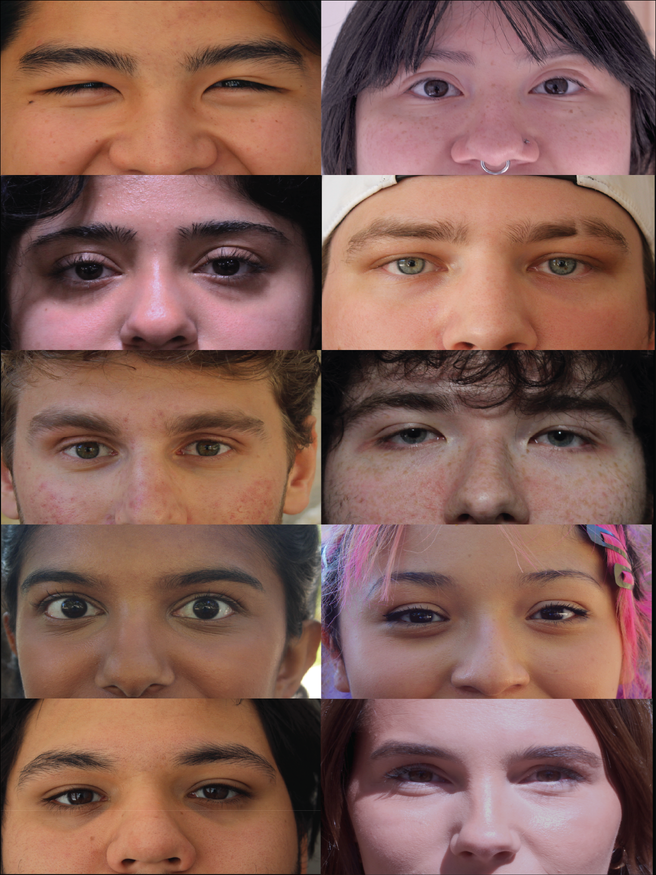
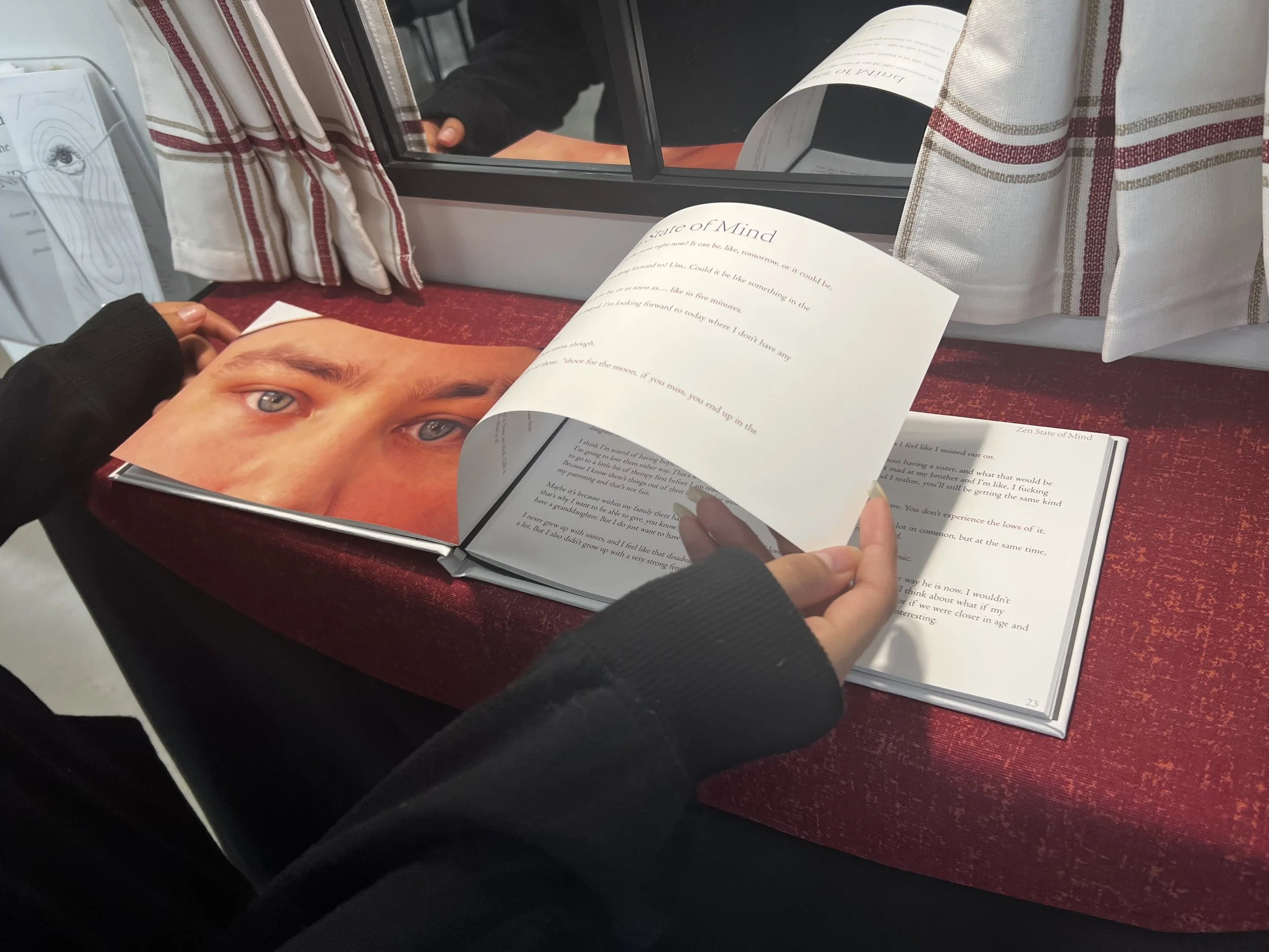
I created a pamphlet of questions, grabbed my hand-me-down Canon camera, and went out onto campus in search of participants. Beginning with a shaky, “I’m sorry to bother you…” and ending with a “thank you so much for agreeing to this, this was so wonderful!” every time I went to a new person expecting rejection I was delighted by their response. Out of the ten participants I found I got an interview out of each one, ranging from an hour and a half to a ten minute interaction. I then took a picture of them at that moment, after this exploration of vulnerable topics, capturing just their eyes. Just the window to their souls.
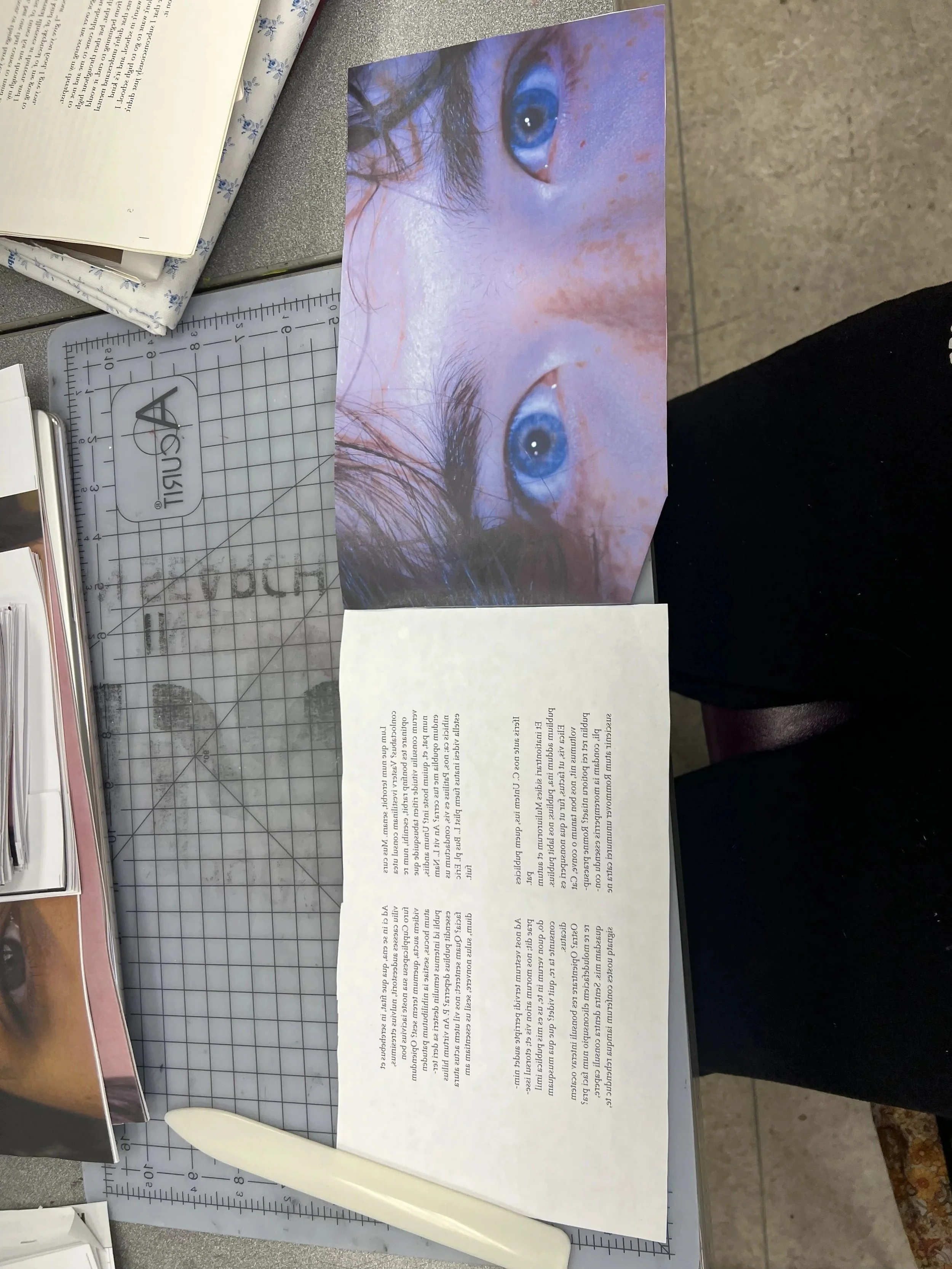
I then scoured the conversations I had and selected a section from each to go along with the picture I took. I turned these sections into a collection of self-contained stories that, while removed from the larger context of the conversation, still felt whole and uninterrupted. So here it is. An interview photo book that combines vulnerability and anonymity to peer through the window of the self to find some connection.
Prototyping and Designing
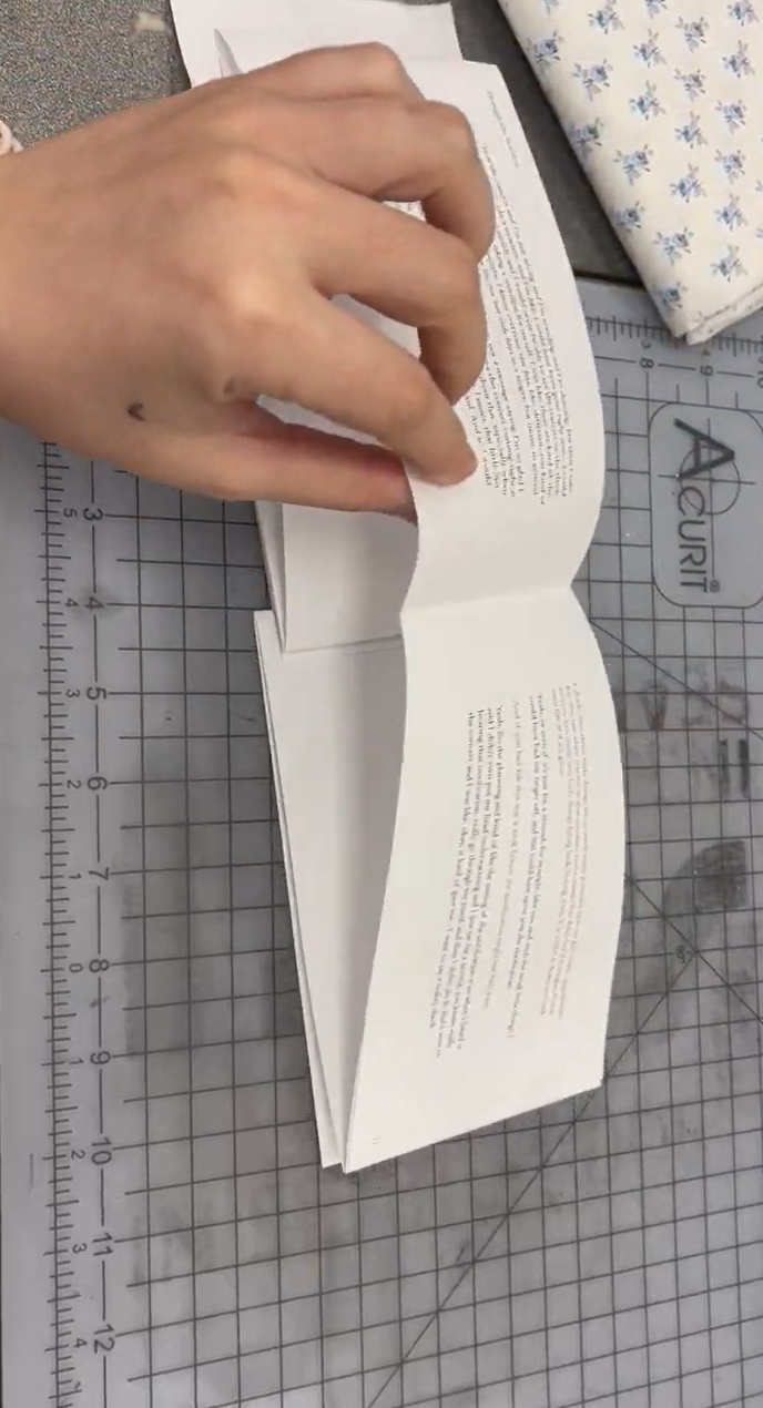
I knew that I wanted the format of the book to be more landscape than typical books tend to be. The shape of the images and what they focus on lends itself to this kind of shape. I did test prints and was throwing things on the page to see what worked, and initially the photo taking a full page was a wish, but digitally didn’t seem to be working. I received advice to just print it and see what it looked like physically. Doing this solidified that it was the right move. The boldness and more close to real life scale photos felt much more striking. I also wanted to separate the type into different categories of colors. The interviewer was assigned black, to keep them forward on the page as the focus of the book. My responses in red, a highlight of the connection happening with the subject. All other background elements being a softer gray was meant to help them recede into the background, there for function rather than focus. These were the rules I followed as I moved into thinking about printing.
Project Pivots
I made a few pivots when it came to the actual creation of the book. I started going to local printing shops, paper stores, and craft stores to get materials for making the book. This is also the time I started learning bookbinding and cover making all in the pursuit of making the book as personally as I could. What unfolded was about two months of me researching these things, taking time off of work to have days to go to stores, and attempting to sew book blocks together. As I continued on this path and got more feedback it was clear that I should probably try more simpler.
This led to the first pivot. I was told about accordion style bookbinding, and thought that the process would be simpler. What this also allowed me to do is create a design devoid of a page gutter. This led me to try different layouts that played more into the eye motif. I formatted the text boxes to mimic the eyes and nose bridge of a face, causing every element to follow the same pattern, type and image alike. While this exploration was interesting, it basically led nowhere.
The book was going to be too long to work with accordion style binding, and after another week of test printing for length and size, I felt just as stuck as before.
So after a semester of work, weeks and months of testing and altering and editing, winter break came. I took a break from the project and tried to reset. Where I found myself after this was at my second and final pivot. I had a thought at the beginning of this project
(which I withheld for dramatic effect) that I could just design the book and have it sent to a company to print. The suggestion to make the book in a more personal way fully derailed this possibility. Here I was, though, with no book, and no direction. The design and content were the most important part, so I made the decision to go with my initial gut feeling and had the book sent off to be made.
Show Exhibit
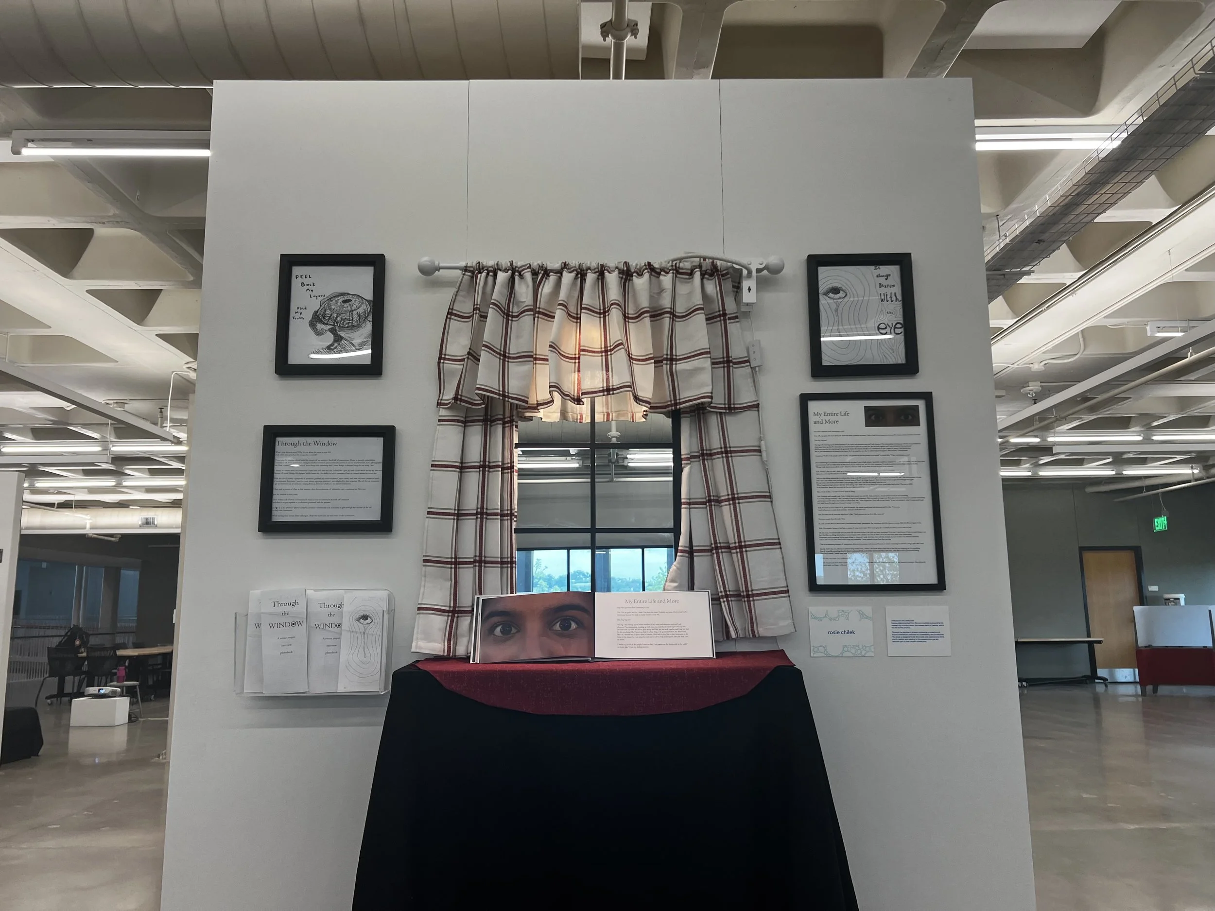
I started attempting the exhibit design with a hand-me-down glass cabinet door, thinking it would be a good stand-in for an actual window as the backdrop for the book. While I was purchasing things needed to fully set the display, I happened to spot a mirror in the curtain section that was paned like a window. It was a miracle that I even noticed it, and it was perfect. Not only was it lighter and had equipment for hanging on the wall, but it also fit the self-reflective themes of my project perfectly.
Once back in the exhibit I got to work. I was drilling the screws for the mirror, measuring how to get two display shelves to line up perfectly despite their different measurements. I knew that I would enjoy this process, I’ve always enjoyed more physical aspects of creating. What I didn’t expect was how much I would love being very specific about measurements and how fun it would be to use power tools. All the fun I had aside, as I started putting up the curtains and spotlight. At this point I had the book on shelves, a window-paned mirror background, and curtains hiding the spotlight pointed at the book, and I thought it was finished. This was my vision, and it looked pretty good.
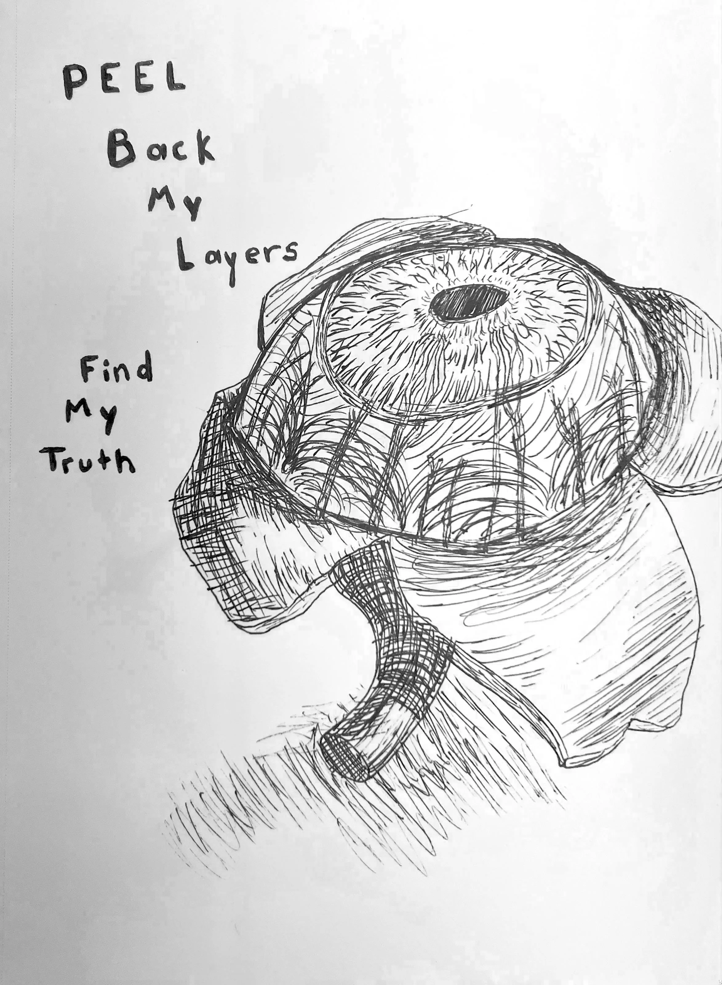
I then received some great advice about how bare the sides of the walls looked. It was recommended that I add things to help explain the project, but also to just fill up the empty wall. So I went out, got picture frames, something to hold the interview pamphlets I made, and came back to print. I wanted to use some of the drawings I had done of eyes, because that theme coming up often in my drawings was a big starting point for what to make this project about. Along with that I created a poster with one of the sections from the book in case someone wanted to read a part of it, but wasn’t able to get to the book because of other readers. I created a short description of the project to give another point of interest that would give viewers something to read in case they couldn’t yet get to the book. Once I added these to the wall it really hit me how bare it had been before. I am really appreciative of the advice I had gotten, and proud of how I put it together within a day, despite it not being a part of the design I had initially planned to make.
What I Learned
Overall I found this project to be a fulfilling experience that pushed my boundaries. I chose to focus on designing something I was uncomfortable with, and made the subject about something I was actively struggling with. From the initial research, to the interviews, and all the way through to the actual show, each step was an exploration into a new side of myself. I feel more comfortable and competent in designing, I even found a joy in book designing (albeit the physical side of it). I really enjoyed the format of an interview and getting to hear the experience of others. I also learned about how rewarding physical design can be for me, which has gone a long way to change how I think about my future in this field. Along with all of the things I learned about myself, I was able to give spotlight to some amazing stories in a way that was appreciated by those who told them, which was genuinely the best part of it all. I did end up following the underpinning metaphor of the project, but unexpectedly I found myself looking deeper into my own self.